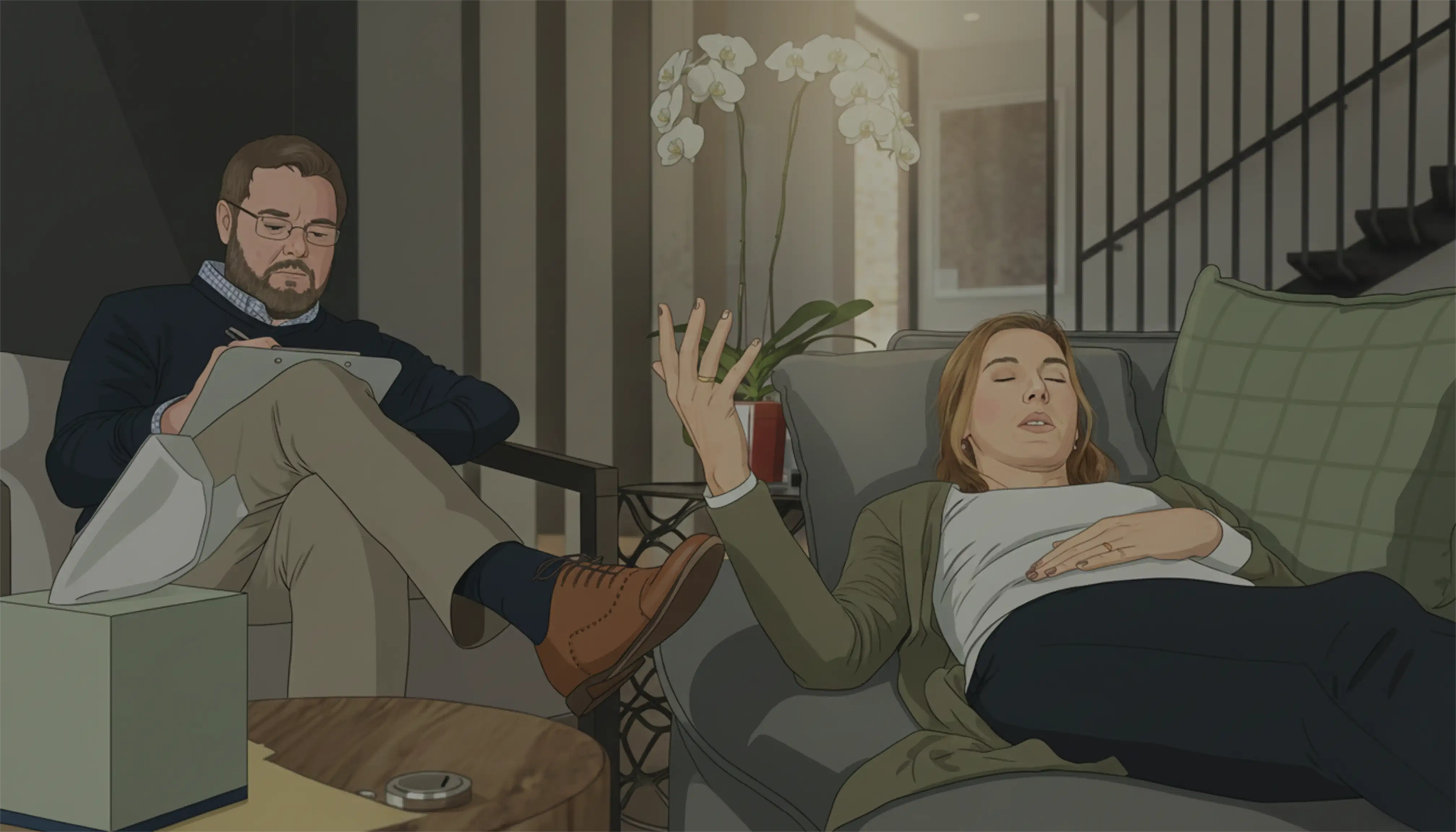
The Myth of Pretty Screens
Many designers think great design starts in Figma or Sketch — wireframes, gradients, animations, and voilà, masterpiece. But real product design starts before a single pixel is drawn. It starts with listening to real people, understanding their problems, and figuring out what they really need. In one fintech project, we spent days building a dashboard we loved — sleek charts, smooth animations, the works. Users testing it were confused and frustrated. That’s when we learned: a beautiful screen is meaningless if it doesn’t solve a real problem.
What Users Actually Want
Users rarely speak in design language. They speak in feelings:
“This feels stressful.”
“I’m not sure what to do next.”
“I’m nervous to press this button.”
In fintech apps, that nervousness is usually about trust and clarity. A designer’s job is to translate those feelings into actionable solutions — from hierarchy and labels to flows and micro-interactions. Listening carefully turns frustration into a clear, confident user experience.
Real Fintech Moment
During a merchant wallet app redesign, we added an analytics card that we thought was amazing. Users ignored it. Why? It wasn’t answering their most pressing question:
“Did I get paid today?”
We redesigned it to show real-time payments, current balance, and simple status updates, and engagement jumped overnight. Functionality always beats style when it comes to adoption — a lesson we never forget. ✅
Listening Is a Skill
Listening isn’t passive — it’s active. Here’s how we practice it in design:
Do:
Ask why, not just what.
Observe hesitation carefully.
Note confusion as a clue, not a problem.
Don’t:
Assume silence means understanding.
Ignore feedback that feels uncomfortable.
Every hesitation is a signal, every question a hint at a better flow. This is what separates someone who “makes things pretty” from a designer who solves real problems.
Design That Feels Human
Human-centered design is calm, predictable, and honest. Small touches make a huge difference:
Friendly confirmation text instead of robotic messages.
Progress bars or micro-feedback to reduce anxiety.
Clear outcomes so users feel in control.
In fintech, users are nervous about money. By adding tiny human touches, the app feels safe — and trust is the ultimate UX win. 💛
Ego vs Empathy
Designers love novelty and complexity; users love simplicity and clarity. If your beautiful chart slows someone down or confuses them, it fails.
Empathy > aesthetics every single time.
Prioritize observing, listening, and designing around real user needs, not portfolio flair. In fintech, small changes that reassure users are worth more than flashy animations.
Final Thought
Great product design is 80% listening, 20% drawing. Tools like Figma just help you express the solutions you already discovered. Solve problems, reduce confusion, and respect user goals — that’s the real measure of success. When users leave your app feeling confident, calm, and understood, you’ll know all the hours of observing, testing, and iterating were worth it. 🌟
Follow me to keep in touch
Where I share my creative journey, design experiments, and industry thoughts.